top of page

2018-2019 /Publiction design / Branding/ Illustration
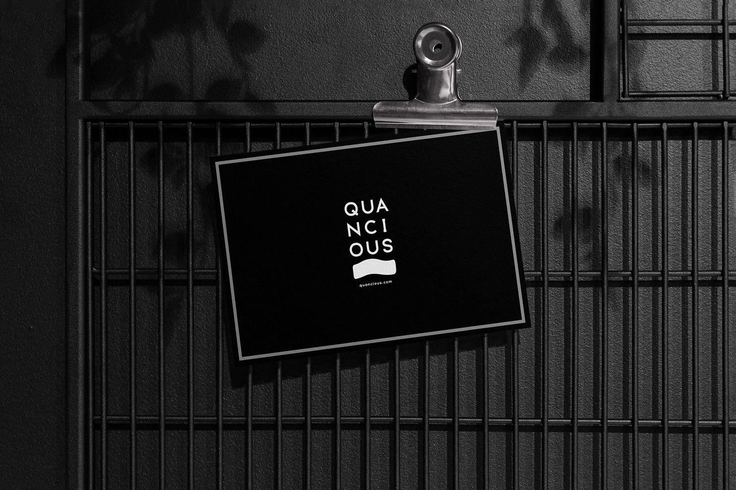
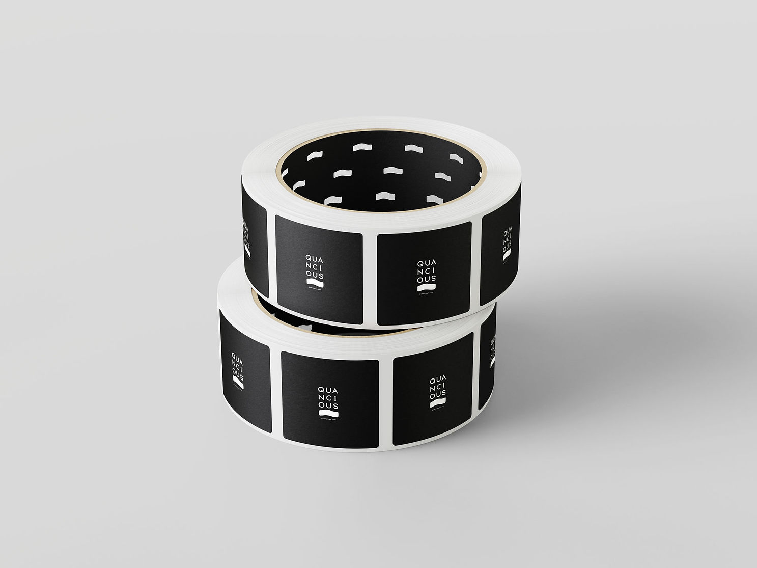
Quancious (Branding)
As a brand that is aware of the water crisis plaguing our planet, we wanted to communicate the same, aesthetically, through our logo. We symbolised water as a wave and incorporated it in our logo unit. Then we used the brand name and toyed around with it in such a manner that it site aesthetically with the symbol of the wave.


Brand Manual


bottom of page