top of page
2023/ direction / Branding /Animation
Challenge : Create a captivating name, brand identity, and visual identity for our client's product, differentiating it in the market and resonating with the target audience. Our goal is to establish a strong brand identity that reflects the product's essence and values, fostering recognition and loyalty among consumers.
Project Goal: Develop a comprehensive and cohesive brand identity beyond surface-level elements. Understand the product's unique selling points, target audience, and emotional appeal to forge a profound connection and loyalty. Combining a compelling name, thoughtful visuals, and a consistent brand personality, establish a powerful brand presence with a lasting impact on consumers and market success.
Result:
"Indian Standard Time" is a triumph, embraced globally and by discerning Indian consumers. The brand name captures India's cultural context and the laid-back approach towards time, strengthening its identity and appeal. With a thoughtfully selected name, playful tone, and diverse flavors, it enjoys widespread recognition and loyalty, securing a prominent position in the competitive alcohol market. Celebrating life's moments, the brand leaves a lasting impact on consumers, driving industry success.
IST ( Hard Seltzers )
Credit
Art Direction _ Silpa S
Copy Writer_ Mehernaz Jila
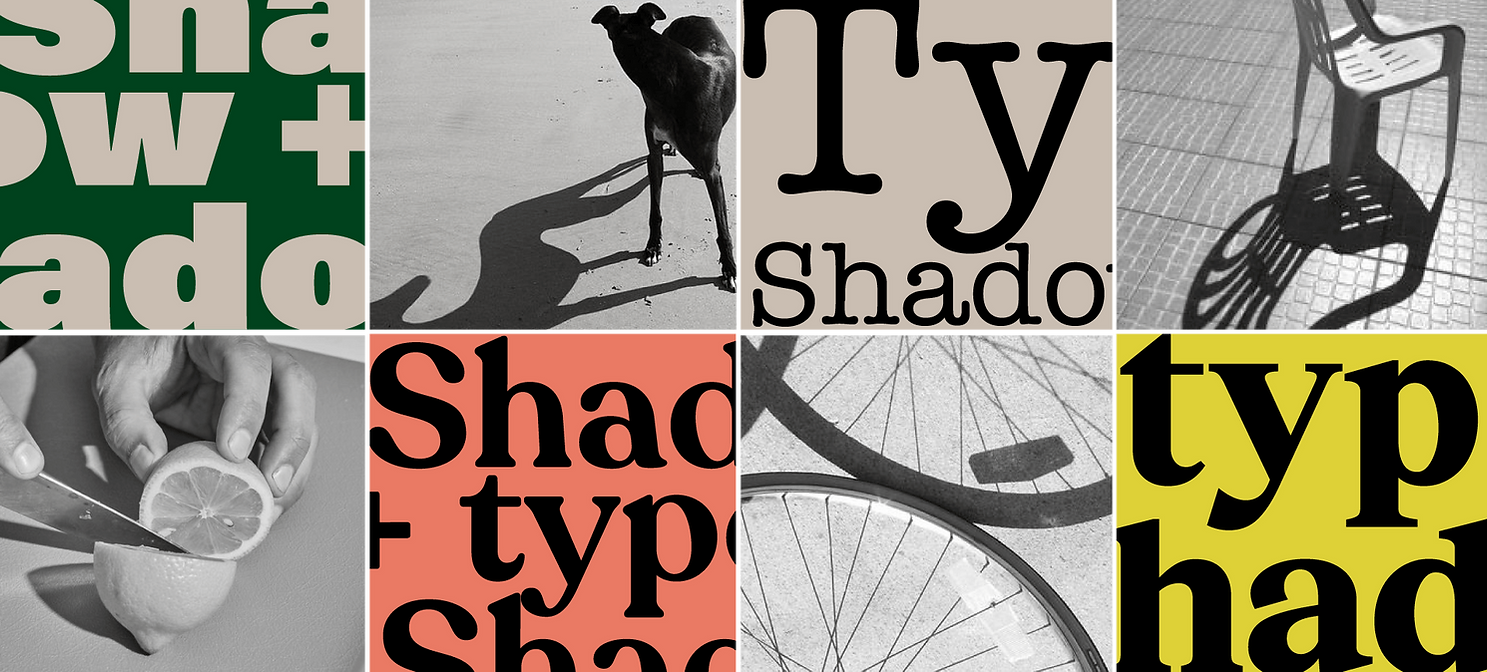
The logo embodies the concept of timekeeping, drawing inspiration from ancient methods of tracking time using the sun and shadows. The design captures the essence of "Indian Standard Time," where time flows freely and embraces the Indian culture's laid-back approach to punctuality. The unisex font selection ensures an inclusive appeal to our
diverse audience.

Numerous logo sketches were explored, each emphasizing the playfulness of time and shadows. The design team experimented with various creative concepts while keeping in mind the essence of the brand. Shadows, clocks, and
sun-inspired elements were incorporated into the logo options.


The mood board sets the tone for the brand. Targeting educated individuals aged 25-35 with disposable incomes, the mood board reflects a contemporary and intelligent vibe. The focus on health-conscious choices is evident, and the transparent colour palette symbolizes the clean and refreshing nature of hard seltzers. The language used is relaxed, approachable, and sprinkled with humor, reflecting the brand's easy-going nature. The key brand tagline, "Any time is a good time," encourages consumers to enjoy "Indian Standard Time" without constraints.


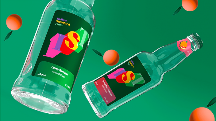
The label design showcases the first two flavors: Lime and Grapefruit. A bold geometric display logo stands out, accompanied by a light gradient patch that enhances the flavor's vibrancy. The IST logo takes center stage, bursting with colors that represent the brand's vibrant personality. Flavor illustrations and names are prominently featured to help consumers identify their preferred taste.


bottom of page